Looking at samples of real student posters can help you generate ideas and define your goals. As you get started, it may be helpful to look at examples of finished posters.
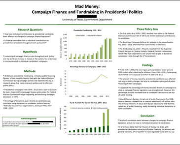
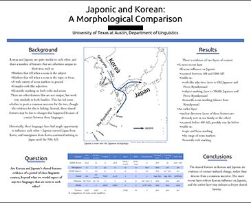
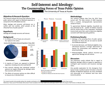
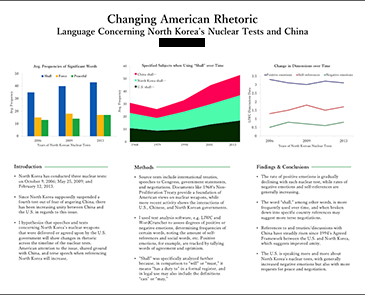
Below are a number of sample posters created by UT undergraduates. There is a brief discussion of each poster highlighting its greatest strengths and areas where there is room for improvement.
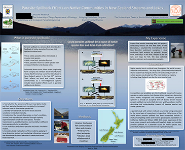
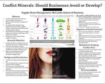
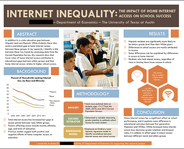
Strengths
- More than one type of visual aid
- Logical order for sections
- Acknowledgments
Room for improvement
- Background may be distracting, or detract from content
- Sections and images are not aligned
- Too many visual components clutter poster
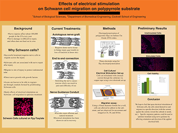
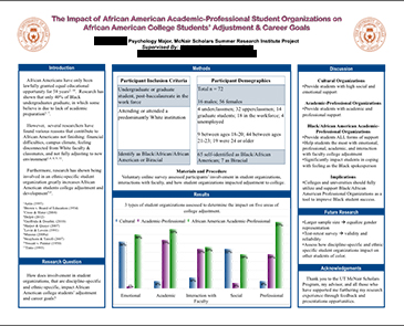
Strengths
- White space
- Legible text and graphics
- Reports preliminary results
- All participants listed as authors, with affiliations provided
Room for improvement
- Lacks Citations and Acknowledgements
- Labeling of images/graphics
- Inconsistent text alignment
- Color-saturated background
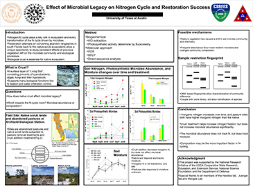
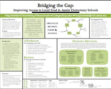
Strengths
- Clearly defined research questions
- Effective use of visual aids
- Clear organizational structure
- Bullets break up text
Room for improvement
- Technical language/undefined acronyms (accessible to limited audience)
- Narrow margins within text boxes
- Too many thick borders around boxes
- Uses UT seal instead of college or university wordmark
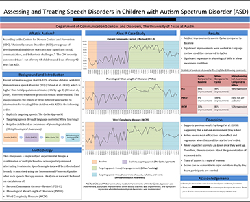
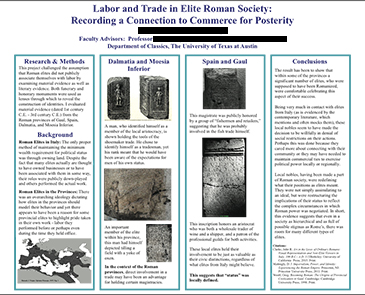
Strengths
- Clear introductory material
- Use of bullet points
- Logical flow
- Color-coding in graphics
Room for improvement
- Lacks references section
- May not be accessible to all audiences (some technical language)
- No need for borders around sections (the blue headers are sufficient)
Strengths
- Compelling visual aids
- Strategic use of color
- Clear sections
- Font sizes
Room for improvement
- Inconsistent fonts in body text
- Editing
- Abstract section mislabeled
- Bullet points are great, but only if they’re used judiciously
Strengths
- Parameters of study well defined
- Clearly defined research question
- Simple color scheme
- Clear sections
- Use of white space
Room for improvement
- Discussion of Results
- Minor formatting misalignments
- Long title
- Unauthorized use of UT seal (use wordmark instead)
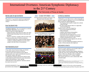
Strengths
- Venn diagram in discussion
- Consistent graphics
- Multiple types of visual aids
Room for improvement
- Light text on dark background
- Color backgrounds should be avoided, especially dark ones
- Unlabeled, non-credited photos
Strengths
- Easy to read
- Clearly defined research question
- Use of white space
- Simple color scheme
- Use of shapes, figures, and bullets to break up text
- Compelling title (and title font size)
- Clean overall visual impression
Room for improvement
- Many sections without a clear flow between them
- Lacks acknowledgements
Strengths
- Logical flow
- Simple color scheme
- Use of images/graphics
- Clear title
- Accessible but professional tone
Room for improvement
- Length/density of text blocks
- Tiny photo citations
- Connections between images and descriptive text
- Vertical boxes unnecessary
Strengths
- Easy to read
- Strategic use of color
- Use of white space
- Compelling title
- Font sizes throughout (hierarchy of text)
- Simple graphics
Room for improvement
- Lacks clear Background section
- Relationship of Findings and Conclusion to Research questions
- Bullet points are great, but only if they’re used judiciously
Strengths
- Font sizes
- Simple color scheme
- Use of visual aids
Room for improvement
- Uneven column width
- Center-justfied body text
- Lacks “Methods” section
Strengths
- Font sizes
- Clear sections
- Logical flow
- Simple graphics
- Use of white space
- Use of bullets
Room for improvement
- Too many different font styles (serif and sans serif, bold and normal)
- Concise interpretation of graphics
Strengths
- Accessible visual structure
- Clear, simple graphics
- Use of white space
- Fonts and font sizes
Room for improvement
- Analysis of graphic data
- Discussion of significance
- Lacks author’s affiliation and contact information
Strengths
- Balance among visuals, text and white space
- Data presented in visual format (SmartArt)
- Simple color scheme
- Font sizes
- Accesible to many audiences (simple enough for general audience, but enough methodological detail for experts)
Room for improvement
- Some more editing needed
- When targeting an expert audience (as in the methodology section), should also report statistics (r, p, t, F, etc.)
- References
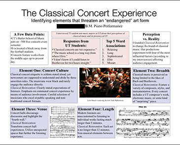
Strengths
- Large, clear title
- Creative adaptation of sections
- Use of lists (rather than paragraphs)
- Accessible to diverse audience
Room for improvement
- Logical flow
- Connection between visuals (sheet music) and content
- Narrow margins within text boxes
Strengths
- Clear sections
- Strategic use of color for section headers
- Labeling and citation of images
- Accessible to a broad audience
- Clearly defined research question
- Wide margins around poster edges
Room for improvement
- Slightly text-heavy
- Data referenced (“Methodology”) but not discussed
What is my next step?
Begin working on the content for your poster at Create Your Message.


