The space on a poster is too limited to present your entire research project. Extracting important ideas and organizing information efficiently is essential to the poster-design process.
Craft the Take-Away Message
A poster is most effective when its focus is one core idea. Before you begin making your poster, write 100 words or less summarizing the purpose and findings of your research. Your poster should visually communicate this “take away” message.
Summarize Key Supporting Information
What is the take-away message from your project? Is it a creative research method? A finding? A jumping-off point for future research? Your most important ideas deserve the spotlight. Do not waste space on minor details.
Make Your Poster Easy to Read
- Avoid wordiness, unnecessary jargon, and abbreviations not commonly known
- Keep text fewer than ten lines long
- List info with bullet points instead of using full paragraphs
- Make lists of central ideas and grouped concepts
- Emphasize key words with boldface or italics (but avoid underlining)
Create a Logical Visual Flow
People tend to look left to right and top to bottom to process information. You can help the visual flow of your poster with headings, arrows, and/or numbers that direct the viewer where to look next. Make sure the take-away message is not a small note in the margin. The bigger and more central something is, the more your viewers will notice it.
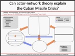
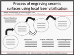
The posters below exemplify different logical visual strategies.
This visual strategy can effectively depict complex networks.
This visual strategy can emphasize the research process, and may be an effective strategy if you are still working on your research and do not have results to present.


